This year, I've decided to be a bit more organised about how and when I'm sending out random craft surprises. I tend to send out between 20-30 gifts that I've made in a year anyway, but I wanted to widen the range of people I send to, so I asked people on Twitter to Direct Message me if they'd like to receive a craft gift at some point this year: it'll be a Random Act of Craft Kindness. I've had quite a few responses already, but I'm going to retweet my offer a few more times, to make sure everyone who's interested has a chance to be added to the recipient list.
I've already sent out a couple of gifts to people today, beyond this RACK list, so I may exceed my target of 12 surprises rather quickly!
Keep your eyes open: if you volunteered me your address, it could be you next.... :)
Showing posts with label Craft. Show all posts
Showing posts with label Craft. Show all posts
Monday, 6 January 2014

Friday, 3 January 2014
Here be (paper) dragons!
I recently sold a quilled dragon on a mini canvas from my Etsy shop, and as it's one of the items I make to order, I needed to put it together. I always keep an original of anything I make, especially quilling, as it's so much easier to replicate it later when it can be compared to the original.

That's the original at the top, and the new one in progress below.

I like how they're the same, but they're always subtly different, especially with things with faces: the "expression" is never the same on both version :)
Tuesday, 25 June 2013
A rather pleasant pheasant
My neighbour, who commissioned me to make a duck as a gift for a friend of hers, then followed that up with asking me to create a male pheasant in flight for another gift. You can tell what one of her hobbies is!
So, a distinctive bird like a pheasant is good in some ways, and bad in others. It's recognisable enough that it can be stylised into certain shapes and still be recognisable - good. But if it's so recognisable, it has to be done well in order to look right. - bad.
So, on Sunday, I spent 7 hours sketching, experimenting, and fiddling, until I finally made something that I'm kind of proud of!

It began with the eye and head/neck. I needed to roll two colours of paper as one strip to get the green/blue tone I wanted. I tried doing the red area and the green/blue area with metallic papers to begin with, but the don't stick well to each other at the best of times, and couldn't cope with the pressure I was putting them under.

The head then gained a white neck section, a dash under the eye, and the distinctive narrow beak.


So, a distinctive bird like a pheasant is good in some ways, and bad in others. It's recognisable enough that it can be stylised into certain shapes and still be recognisable - good. But if it's so recognisable, it has to be done well in order to look right. - bad.
So, on Sunday, I spent 7 hours sketching, experimenting, and fiddling, until I finally made something that I'm kind of proud of!

It began with the eye and head/neck. I needed to roll two colours of paper as one strip to get the green/blue tone I wanted. I tried doing the red area and the green/blue area with metallic papers to begin with, but the don't stick well to each other at the best of times, and couldn't cope with the pressure I was putting them under.

The head then gained a white neck section, a dash under the eye, and the distinctive narrow beak.

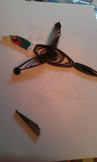
This is what took all the time: translating that drawing there into a self-supporting multi-level 3D piece!

This is the nerve-racking stage: I know what I want it to look like, I just have to believe that it WILL end up looking that way, despite appearances!

I completed one wing, and I really quite like the "powering forward, wing caught mid-beat" effect that a single wing gives, but I'd got everything ready for a second wing, so...

I completed it with two wings, yay!

Fly, little pheasant, fly!!

And, of course, what's better than one pheasant? Two pheasants!
I created a duplicate bird to check how long it would take me to make it again in future, and have a blank to work from if I want to do another. It took me over 3 hours to make the duplicate, so I think this one will never really be cost effective to make, unless people would be willing to pay £60 or so for a paper bird!
Monday, 27 May 2013
A personalised map of South America
A friend wanted a memento of his daughter's travels around South America, marking events and places personal to her, so he asked me to create a personalised map relating to her trip. It was an ongoing process, as we worked out how it was going to work, so to begin with, I started off by doing the outline of South America...



I'm pretty happy with how it turned out, and hopefully the recipient will be too :D
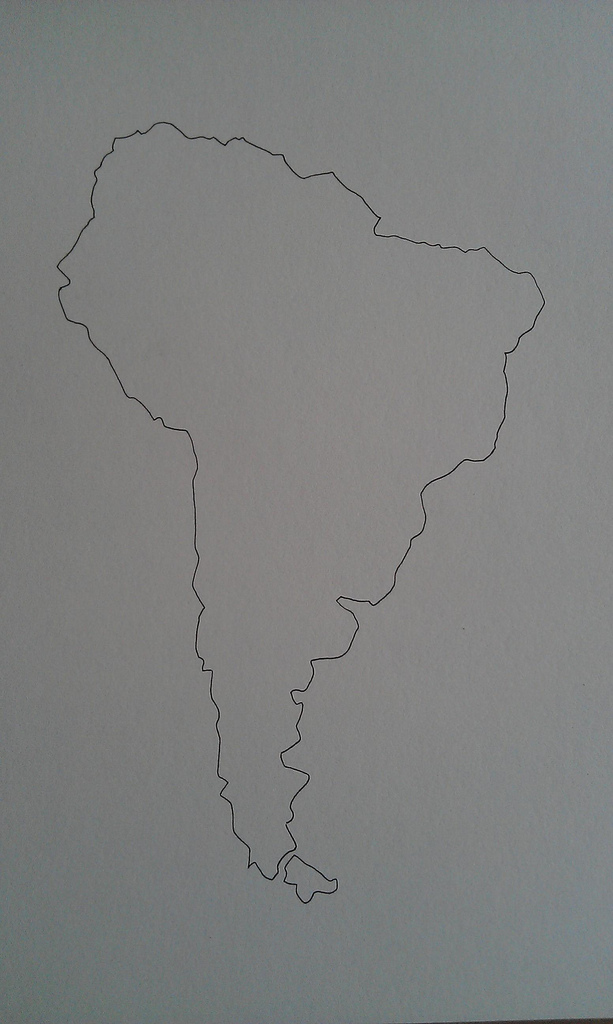
Then, it was decided that rather than doing the whole continent, I'd only fill in the countries that the daughter had actually visited, so I went back, and outlined the countries. I also got information on the things that the daughter had been up to, and I started working out which of those I could recreate recognisably in a tiny stylised way, and began placing them in pencil around the map in the appropriate places.

Once the main items were in place, as I waited for more information on Brazil activities, I began to darken the country borders to make them clearer when the doodles were in, and began doodling in the edges. I really quite liked it at this point, with just touches of filigree at various random places.

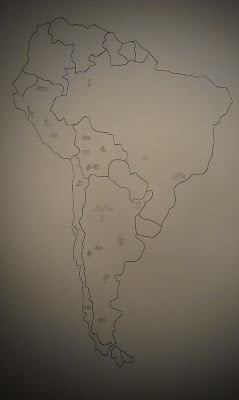
Once I had the final bits of information, I got going on the filling in. So, 8 hours of work later, this is the final map, incorporating llamas, quad bikes, cycling, wineries, lots of drinking, Gay Pride, many credit and debit card losses, a capybara, a boat ride, Machu Picchu, a bungee jump, a piranha, a inter-peak cable basket, lots of hiking, a sloth, an anaconda, a cockroach, a phone in a drink, a waterfall, and the staple of travellers everywhere, table tennis.

I'm pretty happy with how it turned out, and hopefully the recipient will be too :D
Tuesday, 21 May 2013
Pride and Prejudice
Someone on Twitter suggested that Jane Austen would be a good image to do, so I went looking for an image of her online. I'm not a great reader of that sort of classic literature, and I've never read anything by her, but I've been to Bath, so I know that there's a recognisable silhouette of her. Luckily, as it was drawn many many years ago, it's out of copyright, so I was able to use this for my drawing.

Then, since I'm not a fan of her books, I needed some help with what would be a relevant quote. For something like this, I need a fair chunk of text, but it needs to be able to cut off when I run out of space, and still remain coherent. It helps if the sentences are short too! So, I got a few good suggestions, and I used the text listed below to make the final version:

""In vain I have struggled. It will not do. My feelings will not be repressed. You must allow me to tell you how ardently I admire and love you."
Elizabeth's astonishment was beyond expression. She stared, coloured, doubted, and was silent. This he considered sufficient encouragement; and the avowal of all that he felt, and had long felt for her, immediately followed. He spoke well; but there were feelings besides those of the heart to be detailed; and he was not more eloquent on the subject of tenderness than of pride. His sense of her inferiority—of its being a degradation—of the family obstacles which had always opposed to inclination, were dwelt on with a warmth which seemed due to the consequence he was wounding, but was very unlikely to recommend his suit."
And then, after I put that in my shop, I added a postcard version too :D
At some point, I'll need to get to the print shop to get some prints made of the large original, but right now, I'm just too busy!
Saturday, 18 May 2013
I don't always get it right....
Recently, I made a fantasy island map. I took my time, and filled it all in: lovely. I crumpled it up, as part of the ageing process: good. Then I did the next step: singing the edges. Unfortunately, in this case, the singe became a burn! It unexpectedly caught light, and ate into the body of the map, and it was quite a struggle to stop it from burning up the whole map!
Gah: what a waste of time and effort! It's eaten too deep into the paper for the map to look nice, so I can't sell it. Oh well!


Gah: what a waste of time and effort! It's eaten too deep into the paper for the map to look nice, so I can't sell it. Oh well!


The Walrus and the Carpenter
I asked on Twitter what classic texts I should think about doing next, and one suggestion was the Walrus and the Carpenter, from Lewis Carroll's "Through the Looking-Glass". A walrus is a nice, recognisable shape, so last night, I gave it a shot.
First I sketched a few body shapes for a walrus...

Then, I outlined the one I liked best, and went over it with the text of the poem.
I think it's worked out pretty well, even if I do say so myself, so I've popped him in my Etsy shop.Another stock addition!


First I sketched a few body shapes for a walrus...

Then, I outlined the one I liked best, and went over it with the text of the poem.
I think it's worked out pretty well, even if I do say so myself, so I've popped him in my Etsy shop.Another stock addition!


Monday, 13 May 2013
Shakey Willie...
When I'm trying to make a new image design, I usually work with classic texts, and tie a recognisable image that I can create from that text to a part of the text that relates to the image, e.g. the silhouette of Sherlock Holmes is created from a section of text that relates to the description of Sherlock. Sometimes though, the image can be a bit tricky....some things just don't work out so well as a silhouette, and in particular the lack of facial features can make some things look odd.
This is what I think I've ended up with when I've tried to do William Shakespeare. I sketched out what I hoped was an OK rough outline, based on the famous portraits/etchings of him:

Then I wrote out the text outline (using Hamlet's soliloquy , and it just didn't look quite right, somehow. So I sketched the light shape of an oval frame, like a painted portrait would have. Then I felt it might need a suggestion of facial features...but even those don't look quite right to me. Sometimes I don't know if I'm just being over critical, or if it's something best abandoned as a bad idea. What do you think? Leave it blank? Add hints of features? Chuck it?

Gah!
This is what I think I've ended up with when I've tried to do William Shakespeare. I sketched out what I hoped was an OK rough outline, based on the famous portraits/etchings of him:

Then I wrote out the text outline (using Hamlet's soliloquy , and it just didn't look quite right, somehow. So I sketched the light shape of an oval frame, like a painted portrait would have. Then I felt it might need a suggestion of facial features...but even those don't look quite right to me. Sometimes I don't know if I'm just being over critical, or if it's something best abandoned as a bad idea. What do you think? Leave it blank? Add hints of features? Chuck it?

Gah!
Sunday, 12 May 2013
The boy who never grew up....and his fairy friend
This was another of my "I like the idea, I just need time" things...I wanted to do the silhouette of Peter Pan, and do it using tiny writing. Of course, when I finally had time, and the creative urge, I couldn't find the original sketch I'd done. Hence, having to make a new one:

After asking online if it was a recognisable enough shape, I got going with the text block. Luckily, it all worked out well, and I'm pretty happy with the final result:

I posted his pic on Facebook, and one of my friends asked if I could do a Tinkerbell to match. Ah: a challenge! She wasn't in my original plan of sketches (although the Crocodile is), so I had to put together a sketch...

And from that, do the text. Again, I was lucky, and this one worked out well too!

Not bad, if I do say so myself! And now they're both in my Etsy shop: quite a productive day!

After asking online if it was a recognisable enough shape, I got going with the text block. Luckily, it all worked out well, and I'm pretty happy with the final result:

I posted his pic on Facebook, and one of my friends asked if I could do a Tinkerbell to match. Ah: a challenge! She wasn't in my original plan of sketches (although the Crocodile is), so I had to put together a sketch...

And from that, do the text. Again, I was lucky, and this one worked out well too!

Not bad, if I do say so myself! And now they're both in my Etsy shop: quite a productive day!
Saturday, 11 May 2013
Round and round and round...
I'm currently doing a skills swap with my massage therapist: I get treatments, in return for me doing various things for her. Usually that involves doing her social media presence, but as her studio's coming up for its 2nd birthday, she's holding an open night/birthday event, and she's giving away goodie bags on the night. We were chatting, and she had so many things to sort to make sure that it went off well, she hadn't got around to the packaging of the goodies bags, so I volunteered to do that. Her studio is very calm and soothing, and she's very environmentally conscious, so she wanted a goodie bag that was low waste and as environmentally friendly as it could be (within reason and still looking/feeling like it would be a treat to get).
So, we decided on plain brown paper bags, striped paper bags in her company colours for the food treats,and kraft tags, with a bit of decoration on them to perk them up. I suggested quilled "roundels" or "targets" in her colours, which are the only names I can think of to describe the shapes!

It starts with me rolling up a strip of 3mm quilling paper tightly into something called a grape roll.

Then, they needed the next colour, so that got glued on to them (all 40!)


Then, roll all those strips up and glue them on...

Then add the final, outer black strip...

And finally, glue the finished roundels onto the tags for the bags, ready to be filled up and given away next week. Hope they don't get mistaken for Licorice Allsorts!

Phew! I think I've earned my next treatment, as that was at least 4 hours of work! :D
So, we decided on plain brown paper bags, striped paper bags in her company colours for the food treats,and kraft tags, with a bit of decoration on them to perk them up. I suggested quilled "roundels" or "targets" in her colours, which are the only names I can think of to describe the shapes!

It starts with me rolling up a strip of 3mm quilling paper tightly into something called a grape roll.

Then, they needed the next colour, so that got glued on to them (all 40!)


Then, roll all those strips up and glue them on...

Then add the final, outer black strip...

And finally, glue the finished roundels onto the tags for the bags, ready to be filled up and given away next week. Hope they don't get mistaken for Licorice Allsorts!

Phew! I think I've earned my next treatment, as that was at least 4 hours of work! :D
Friday, 10 May 2013
The Owl and the Pussycat
I love it when I get orders off Etsy, but when they're for one of the postcard originals, it can be a bit of a stress too! As each one is done to order, I always have a lurking worry that people won't be happy if the image they get isn't identical to the one I show as the example on the listing, even though that's impossible as each one is unique. Silly, but it's still a niggle at the back of my head. So I focus so hard while doing them, and then there's such a feeling of relief when they're done, and mailed off!
And here's my latest stress-inducer: The Owl and the Pussy-Cat, now en route to Australia.


And here's my latest stress-inducer: The Owl and the Pussy-Cat, now en route to Australia.


Playing with the classics
There a couple of images I want to have a second shot as, as my first versions of them didn't quite work right, to me. So I had another go at Dracula, and Frankenstein.


Dracula, however, I'm not so happy with. I think his hair's too strangely smooth/featureless, so perhaps a few more flicks are needed there. And I've decided the teeth don't work when done with words - I can't get the thin, sharp points I want, and for them to stay distinguished clearly from the surrounding face shape. So I think that the next version will have teeth that are line drawn rather than with words, hopefully that'll make it better.
And here's Frankie and Dracie, together...probably not a pairing I'd like to meet in real life....


I'm happy enough with Frankenstein, as I think I've got a recognisable image of the traditional "look" of him, with the bulging brow, big chin and the neck bolts (none of which are actually a described feature of Frankestein, but it's what we recognise!). So I'll spend some time taking some good photos (ones from my phone just don't really capture the detail), and pop him in my Etsy shop.


Dracula, however, I'm not so happy with. I think his hair's too strangely smooth/featureless, so perhaps a few more flicks are needed there. And I've decided the teeth don't work when done with words - I can't get the thin, sharp points I want, and for them to stay distinguished clearly from the surrounding face shape. So I think that the next version will have teeth that are line drawn rather than with words, hopefully that'll make it better.
And here's Frankie and Dracie, together...probably not a pairing I'd like to meet in real life....

Thursday, 9 May 2013
The heart of the family
A friend asked me to do a simple heart drawing for her, using the names of her family to form the shape of the heart. So, I did it, with the names averaging about 1mm in height. I'm just going to wait and see if she wants a second heart in the middle, or if she prefers it as it is - I always struggle to leave things plain and simple, tend to want to keep adding more!


Wednesday, 8 May 2013
I don't know what it is, but I like it.
Last night, I took to doing some doodling. I wanted some sinuous shapes, with some closely drawn lines to show the curves, so.. that's what I did!
A start, with a pencil outline of where I planned to put the shapes:


I really enjoyed making this, but since I don't really have the wall space for more stuff, it's gone in my Etsy shop instead. Curvy!
A start, with a pencil outline of where I planned to put the shapes:

Then some more.....

And some more...

And then...finished!


Subscribe to:
Posts (Atom)

